
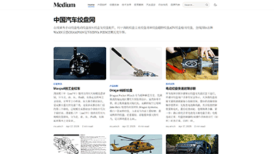
A considered reading experience. Practical controls. Less between your reader and your work.
A blog theme has two jobs: persuade someone to open an article, then make that article worth staying with.
Many themes concentrate on the first. Prose gives equal attention to the second.
Built for Typecho, Prose combines an editorial layout with configurable publishing tools. It suits writers, developers, independent commentators, and anyone building a collection of work rather than a stream of disposable updates.
Its premise is simple: your website should give your work a clear identity without competing for the reader’s attention.
Designed for the Article, Not Just the Homepage
Prose takes its visual cues from reading rather than dashboards: a restrained palette, clear headings, comfortable spacing, and a text column that does not stretch across the screen.
The result feels composed without feeling empty.
The Front-End Experience
| Element | What Prose offers |
|---|---|
| Typography | Inter for interface elements, Source Serif 4 for prose, and system fallbacks for unsupported scripts |
| Reading width | An approximately 680px content column, with wider layouts where browsing benefits from them |
| Color | Light and dark appearances, system preference support, an optional reader toggle, and a configurable accent |
| Homepage | A single-column list or responsive two- and three-column card layouts |
| Article presentation | Cover images, subtitles, author details, publication dates, and updated dates where applicable |
| Navigation | Category and page links, optional search, a mobile menu, and a header that responds to scroll direction |
| Long-form reading | A heading-based contents list, estimated reading time, reading progress, and focus mode |
| Technical content | Markdown styling, aligned tables, footnotes, and independently scrolling wide tables and code blocks |
| Images | Optional modal enlargement and captions for supported image-and-caption formatting |
| Further reading | Author cards, related posts, tags, and previous/next article navigation |
| Additional pages | Dedicated Archives and Links templates, alongside standard posts and pages |
| Discussion | Native comment integration, including retained comment history when new comments are closed |
These are not separate visual tricks. Together, they establish a consistent hierarchy: the article comes first; supporting information stays available without demanding equal attention.
The Problems Prose Is Built to Solve
Good writing can still be difficult to read
An article may be carefully researched and clearly written, yet arrive inside a page that makes reading unnecessarily tiring.
Overlong lines make it harder to find the start of the next sentence. Crowded paragraphs flatten the structure. A wide code sample can push an entire mobile page sideways.
None of these problems changes the words. All of them change the experience.
Prose addresses that presentation layer with bounded line lengths, deliberate spacing, readable heading levels, and contained overflow. Wide material remains accessible without turning the whole page into a horizontal scrolling surface.
The point is not to make readers admire the typography. It is to let them stop noticing it.
Long articles need orientation, not more decoration
A reader opening a detailed tutorial or essay needs to make a few quick decisions:
Does this cover my question? Where is the section I need? Do I have time to read it now?
Prose’s contents list, reading-time estimate, and progress indicator answer different parts of that problem. They support both close reading and purposeful scanning.
That distinction matters. Helping someone reach the right section is not a failure to keep them reading from the beginning. It is a useful service—and a reason to return.
Browsing and reading should not have identical layouts
A homepage needs discovery tools. An article needs concentration.
Prose allows a right sidebar on home and archive views while keeping posts and standard pages free of sidebars. Readers can go further with focus mode, temporarily removing surrounding distractions while retaining the article, its contents list, and an exit control.
This is a more useful interpretation of minimalism than simply deleting features.
Information can remain part of the site without remaining beside every paragraph.
Small publishing changes should not require template surgery
Changing a list layout, hiding cover images, moving a widget, or shortening excerpts should be an editorial decision—not an afternoon spent locating PHP templates.
Prose puts those recurring choices in the theme settings.
It is not a drag-and-drop page builder, and it does not pretend to be. Instead, it offers direct control over the decisions a content-focused site is likely to revisit.
That keeps routine maintenance manageable while leaving deeper customization available when it is genuinely needed.
Reading Tools That Earn Their Place
Prose includes useful enhancements without making them compulsory.
Each reading feature can be enabled or disabled independently:
- Contents navigation organizes second- and third-level headings while preserving valid existing heading anchors.
- Reading time and progress provide context for longer pieces.
- Focus mode reduces surrounding distractions and supports Escape-to-exit behavior.
- Lightweight code highlighting decorates explicitly marked JavaScript, TypeScript, PHP, JSON, CSS, HTML, and XML examples without changing their text or executing their contents.
- Image enlargement uses a native modal dialog, with keyboard access and focus restoration. Linked images and recognized gallery-plugin markers are left alone.
- External-link cues identify ordinary outbound body links, preserve explicit targets and relationship attributes, and add new-tab protection where appropriate.
- Related content and author information give readers a natural next step after an article.
The aim is not a crowded reading toolbar. It is a set of small conveniences that appear where they are useful.
What You Can Control in the Backend
Prose’s settings cover appearance, content presentation, reading features, and reusable site components.
| Area | Available controls |
|---|---|
| Identity and appearance | Logo, favicon, accent color, default color scheme, and document language |
| Header | Visibility of top-level categories, pages, and search |
| Homepage introduction | Enable or disable the introduction; set its heading and text |
| Lists and archives | List, two-column, or three-column presentation; covers; excerpts and excerpt length |
| Layout and pagination | Optional right sidebar on home/archive views; numbered or newer/older pagination |
| Reading | Theme switching, contents, progress, reading time, focus mode, author cards, related posts, post navigation, highlighting, and image enlargement |
| Author information | Author visibility, author biography, and related-post count |
| Widgets | Recent posts, recent comments, categories, tags, monthly archives, pages, about text, search, and site links |
| Widget placement | Independent visibility, titles, ordering, footer/sidebar placement, and item counts where supported |
| Footer | One to four widget columns, custom footer text, and credit visibility |
| SEO and sharing | Built-in metadata switch, Twitter/X account, and default sharing image |
| Per-article fields | Cover image, subtitle, SEO description, and sharing-image override |
The built-in metadata includes Open Graph, Twitter Cards, and JSON-LD. It also accounts for archive pagination and indexing rules for search, error, and protected-content views.
These are publishing foundations, not promises of search rankings. Sites with an existing SEO setup can disable the theme’s built-in metadata.
Where Prose Stands Among Typecho Themes
There is no universally best theme. Different themes optimize for different work.
The useful question is not “Which one has the longest feature list?” but “Which one makes my kind of publishing easier?”
| Theme approach | What it prioritizes | Prose’s alternative |
|---|---|---|
| Portal or magazine layouts | Dense discovery, many sections, prominent recommendation areas | A quieter transition from browsing into sustained reading |
| Highly animated designs | Visual personality and immediate impact | Identity through typography, spacing, and editorial hierarchy |
| Bare-bones minimal themes | Few interface elements and simple presentation | A restrained front end with practical reading and configuration tools |
| Plugin-assembled setups | Flexible combinations of separate extensions | Theme-owned implementations of several common reading enhancements |
Prose’s strongest distinction is that a quiet interface does not require an inflexible backend.
You can choose a compact text-led homepage or a more visual card layout. You can use widgets without placing a sidebar next to an essay. You can offer reading assistance without enabling every enhancement.
For personal publishing, technical notes, tutorials, and independent long-form work, that balance is compelling.
For a complex news portal, elaborate animation showcase, or freely composed landing-page system, another approach may be a better fit.
Clear About Its Capabilities—and Its Limits
A theme becomes easier to trust when its claims are specific.
Prose’s code highlighting is lightweight lexical decoration, not a complete language parser. It does not add mathematical rendering, Mermaid diagrams, or task-checkbox support to Typecho’s native Markdown parser. Its interface and settings are primarily in English, and non-Latin typography relies on the configured fallback fonts.
The recent theme-local verification passed:
- Syntax checks across 40 PHP files
- 220 isolated PHP assertions
- 148 browser assertions
- 12 layout checks covering three content templates at four widths
Those checks provide repeatable evidence for the tested theme behavior. They do not certify every production plugin, cache configuration, or real comment-submission workflow.
That is a useful boundary, not a reason to replace evidence with bigger promises.
Choose a Theme That Supports the Work You Want to Keep Doing
The right theme should make publishing feel less like maintaining a display and more like building a body of work.
Prose offers a focused place to do that: distinctive enough to feel intentional, configurable enough to live with, and restrained enough to let the writing lead.
Try it with your own material—not just a demo headline.
Open a long essay. Check a tutorial with code and tables on your phone. Browse an image-heavy post. Turn off the features you do not need.
Then ask a better question than “Does this theme look impressive?”
Does it make my work easier to read—and make me want to publish the next piece?
If that is what you want from a Typecho theme, Prose deserves a place on your shortlist.